ThredUp
ThredUp is an online store with the goal of turning secondhand into the first place to shop. They showcase that thrifting is about shopping with intention, rejecting throwaway fashion, and standing for sustainability.
I designed promotional sale campaigns for ThredUp across two distinct brand eras, adapting my visual approach to the clean, editorial style of the current brand from the bold, expressive layouts of the previous identity.
Agency:
HUb
Creative Directors:
ThredUp, Ryan Scheiber, Sam Verdine
Designer:
Brenna Vaterlaus
Writer:
Finn O’Neil
Photography:
ThredUp
ScopeArt Direction
Digital Design
Print Design
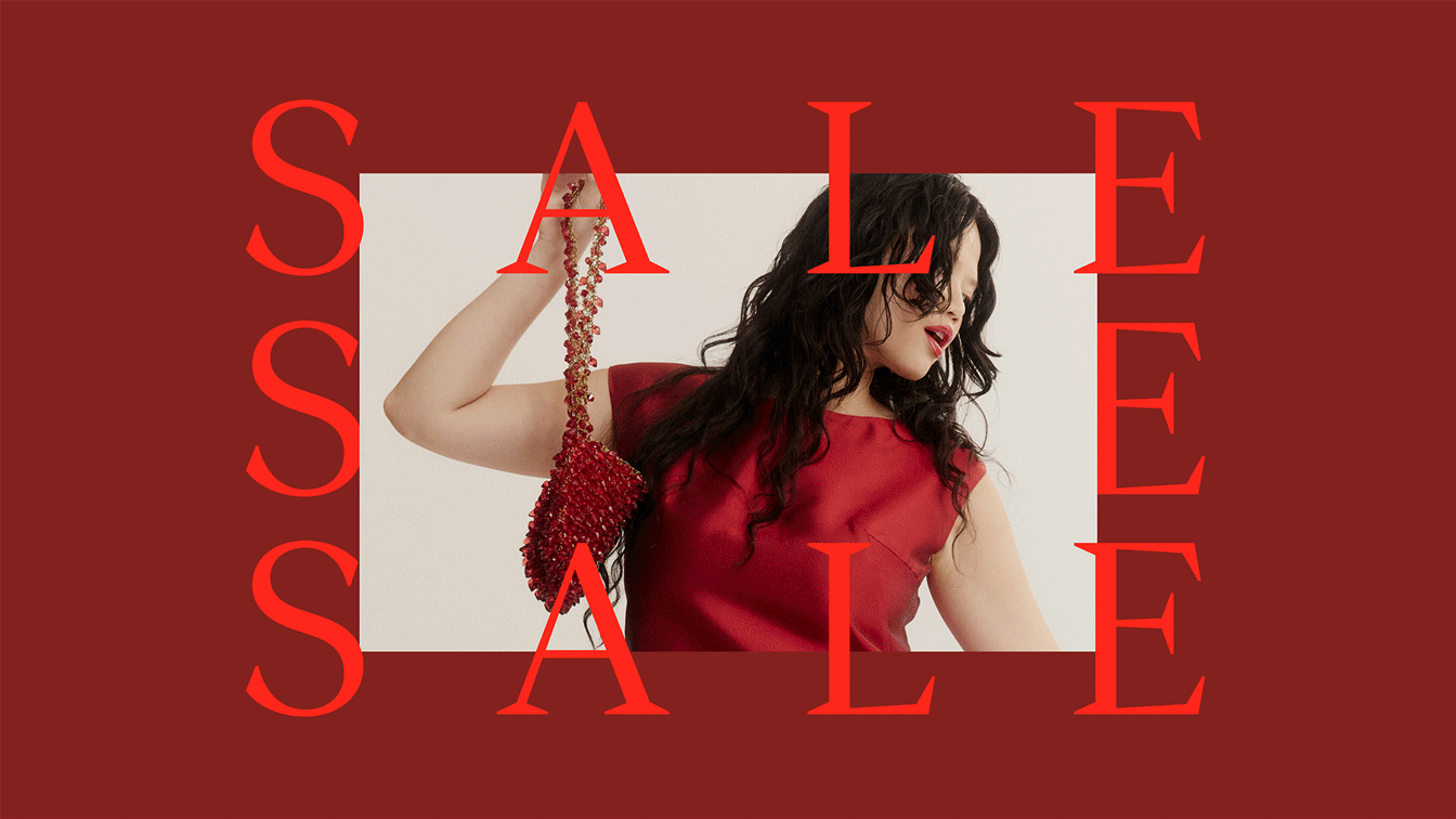
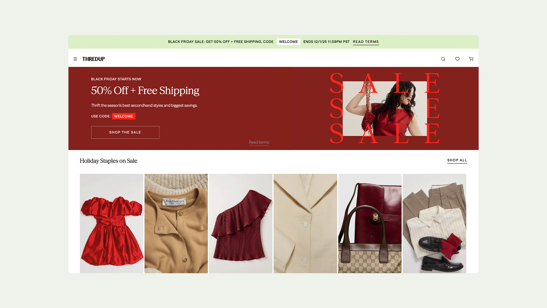
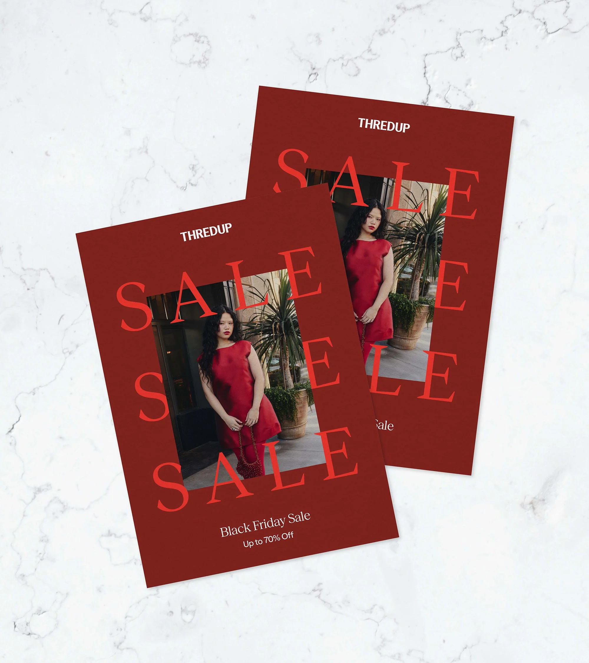
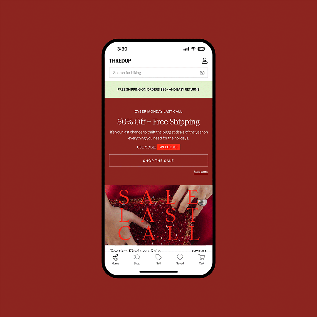
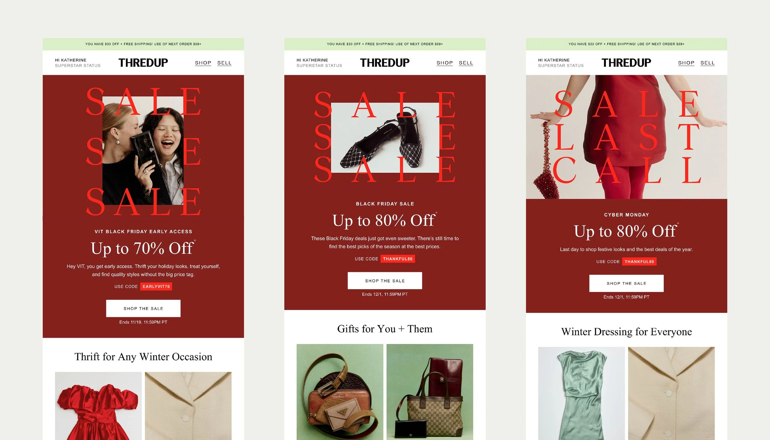
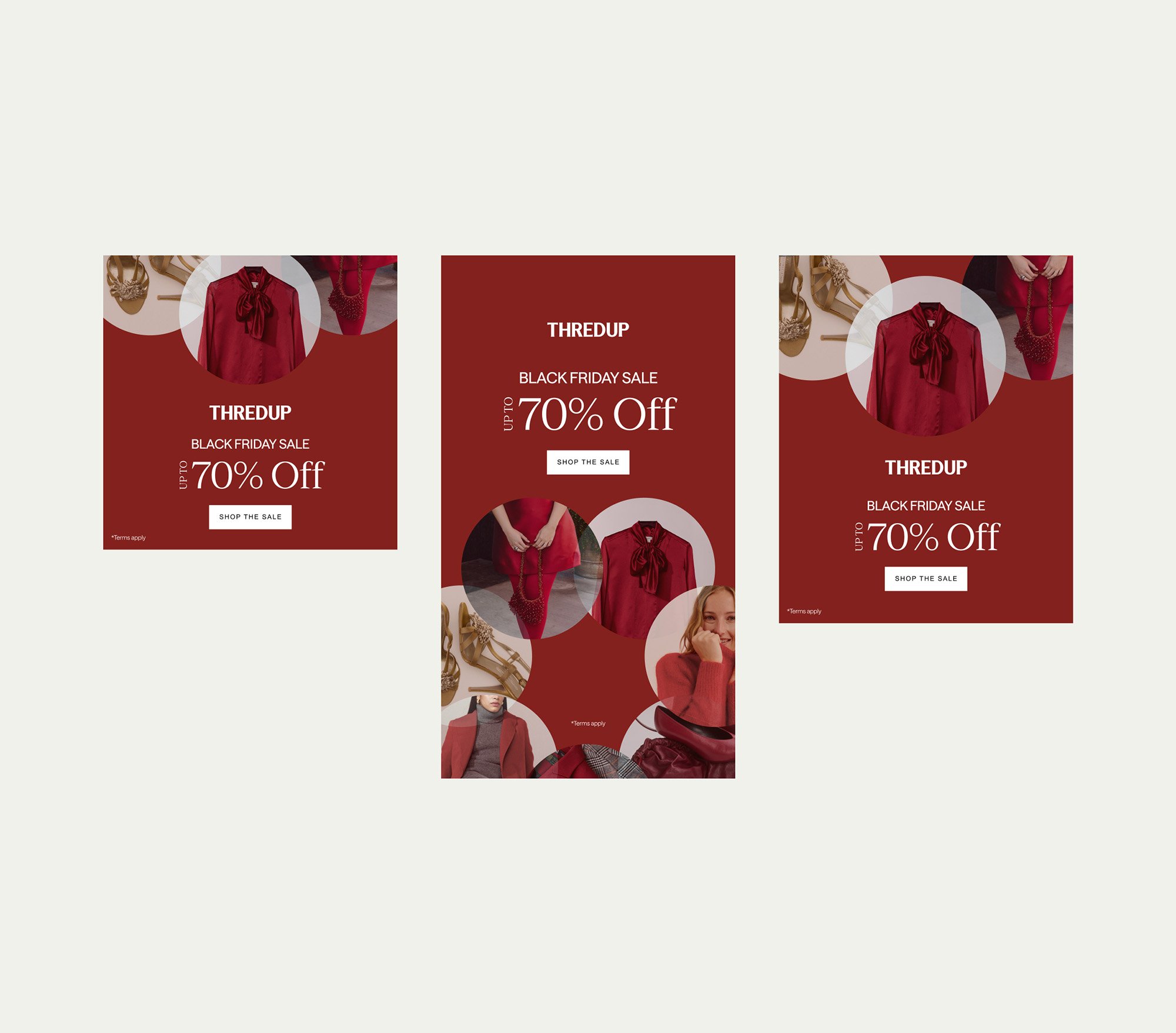
CreditSBlack friday CAMPAIGNThredUp’s Black Friday and Cyber Monday sale aimed to feel bold and elevated while balancing urgency with style. Building on the team’s initial concept, I developed a visual system with typography and photo framing that allowed us to refresh creative throughout the sale.
previous brand
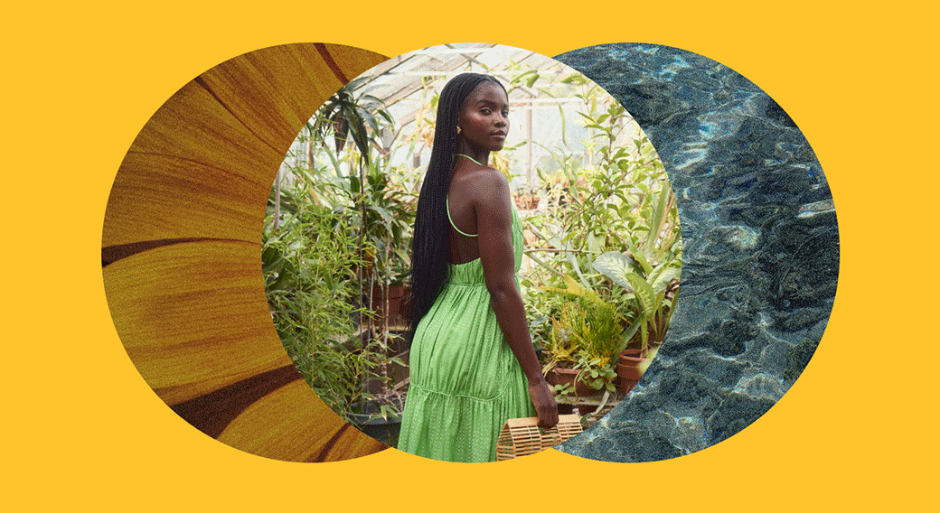
Full circle sale CAMPAIGNThredUp’s Earth Day Sale and Earth Month campaign highlight secondhand fashion as a powerful solution to fast fashion. I reimagined the Earth by drawing inspiration from the layout of old world maps. The overlapping circles, filled with nature and model photography, symbolize the interconnectedness of thrifting and sustainability.


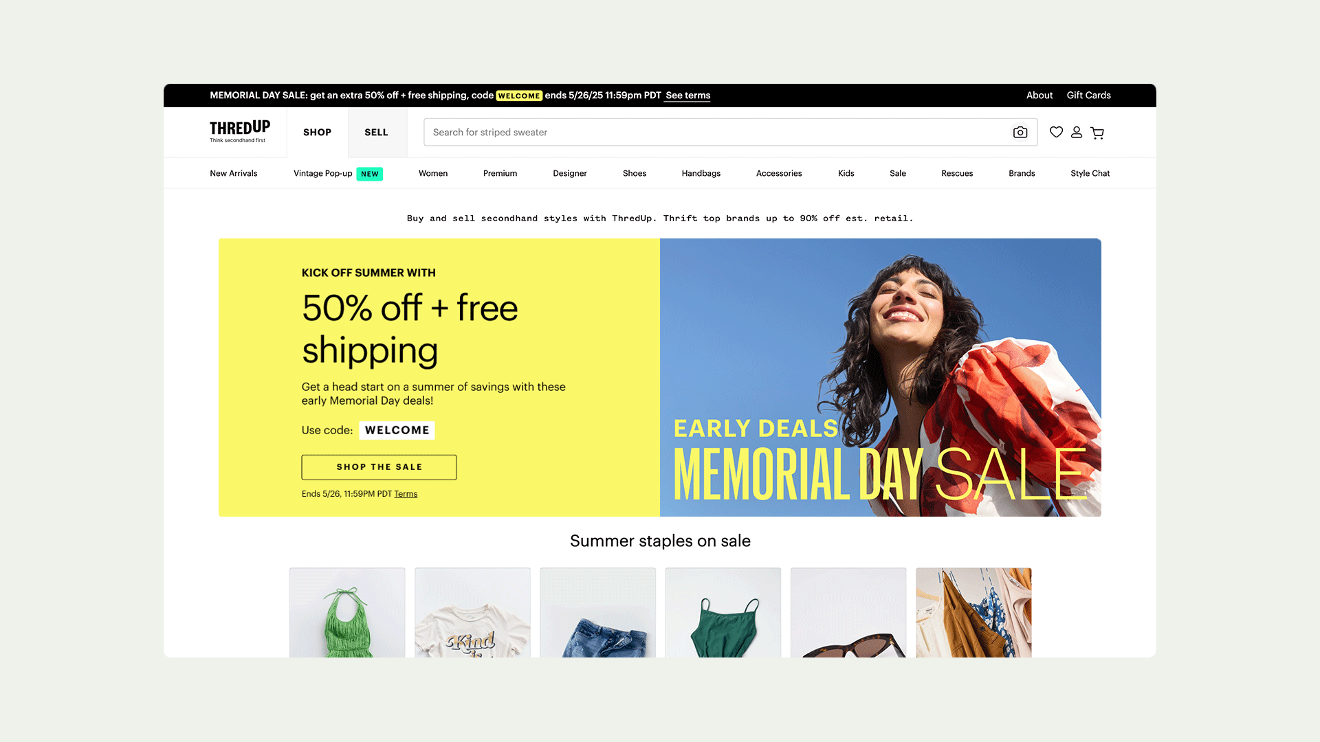
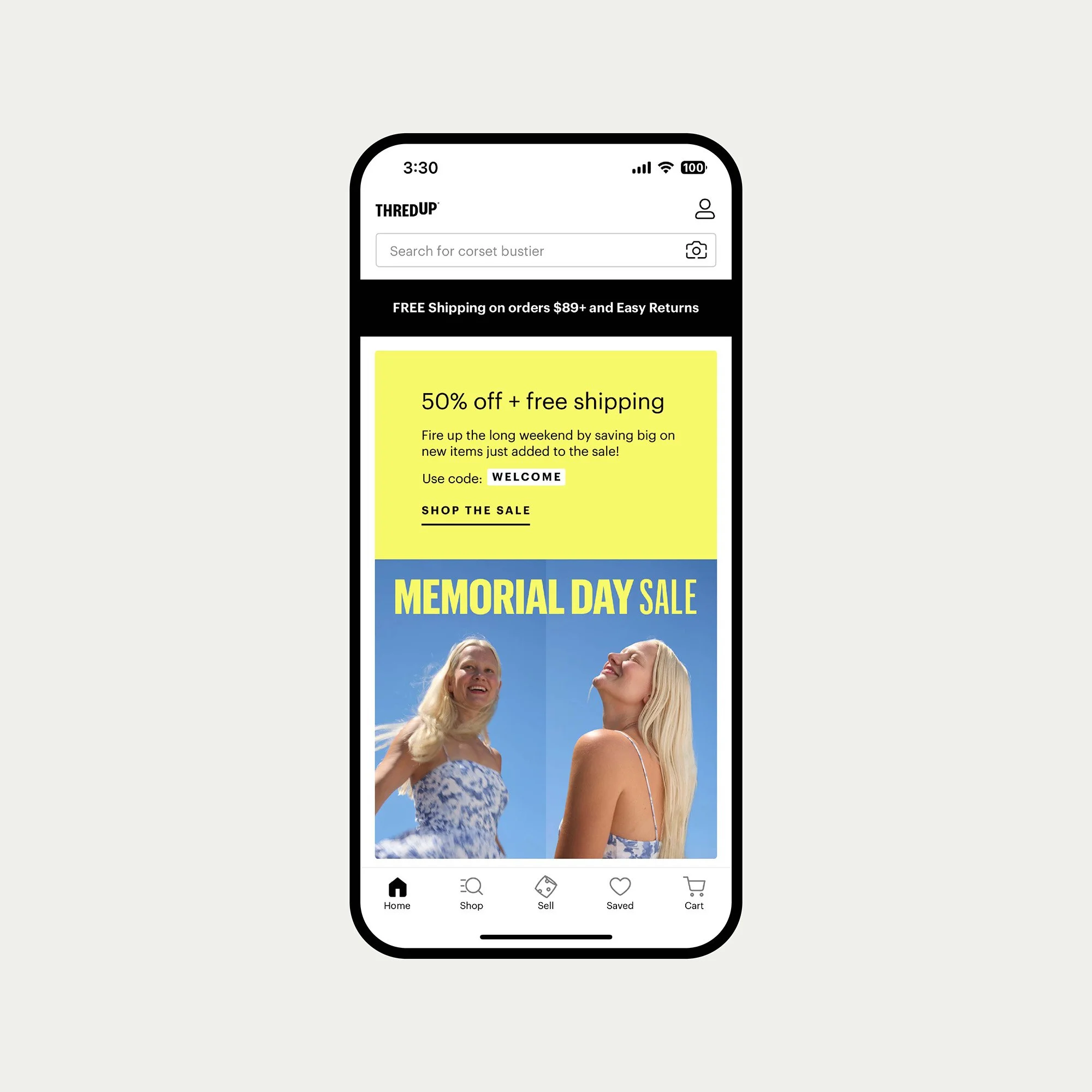
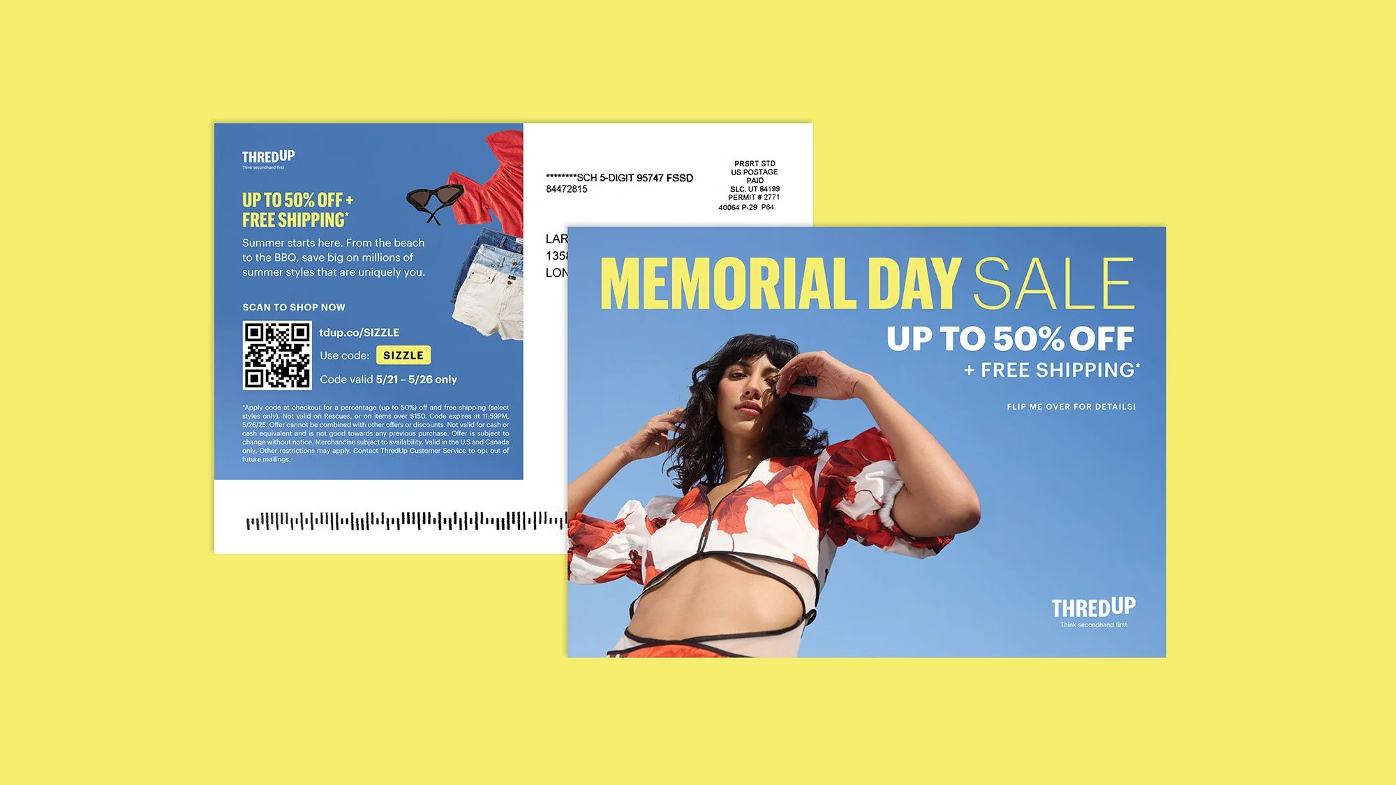
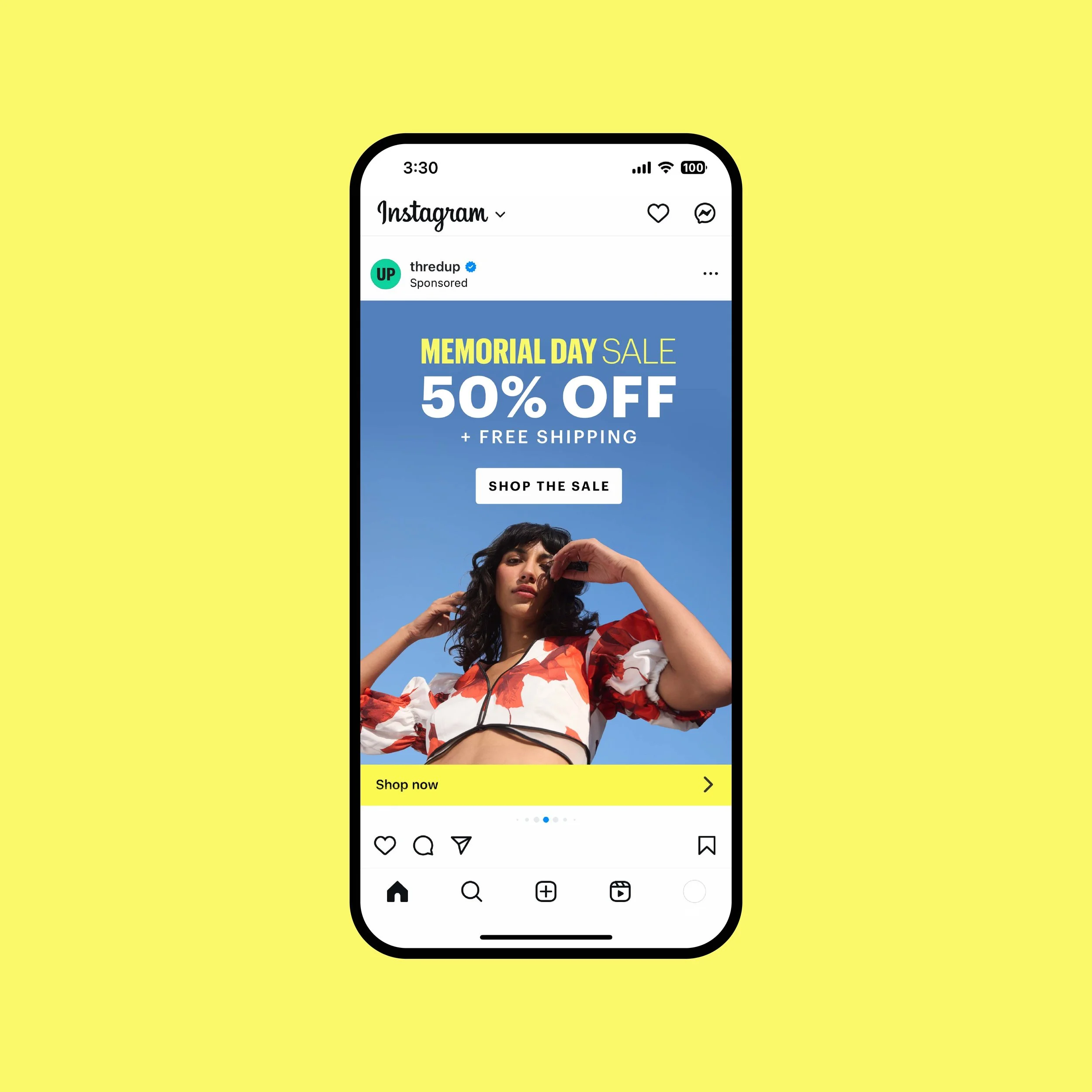
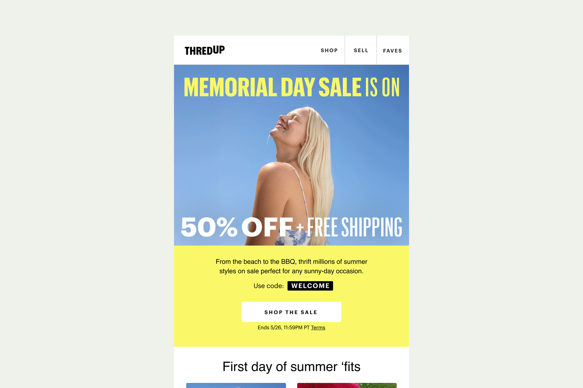
memorial day saleThredUp’s Memorial Day Sale celebrated the start of summer and getting outside. I brought that energy to life by using playful, dancing typography in varying weights to convey movement. The photography featured outdoor shots with clear blue skies to further emphasize the sunny vibe.


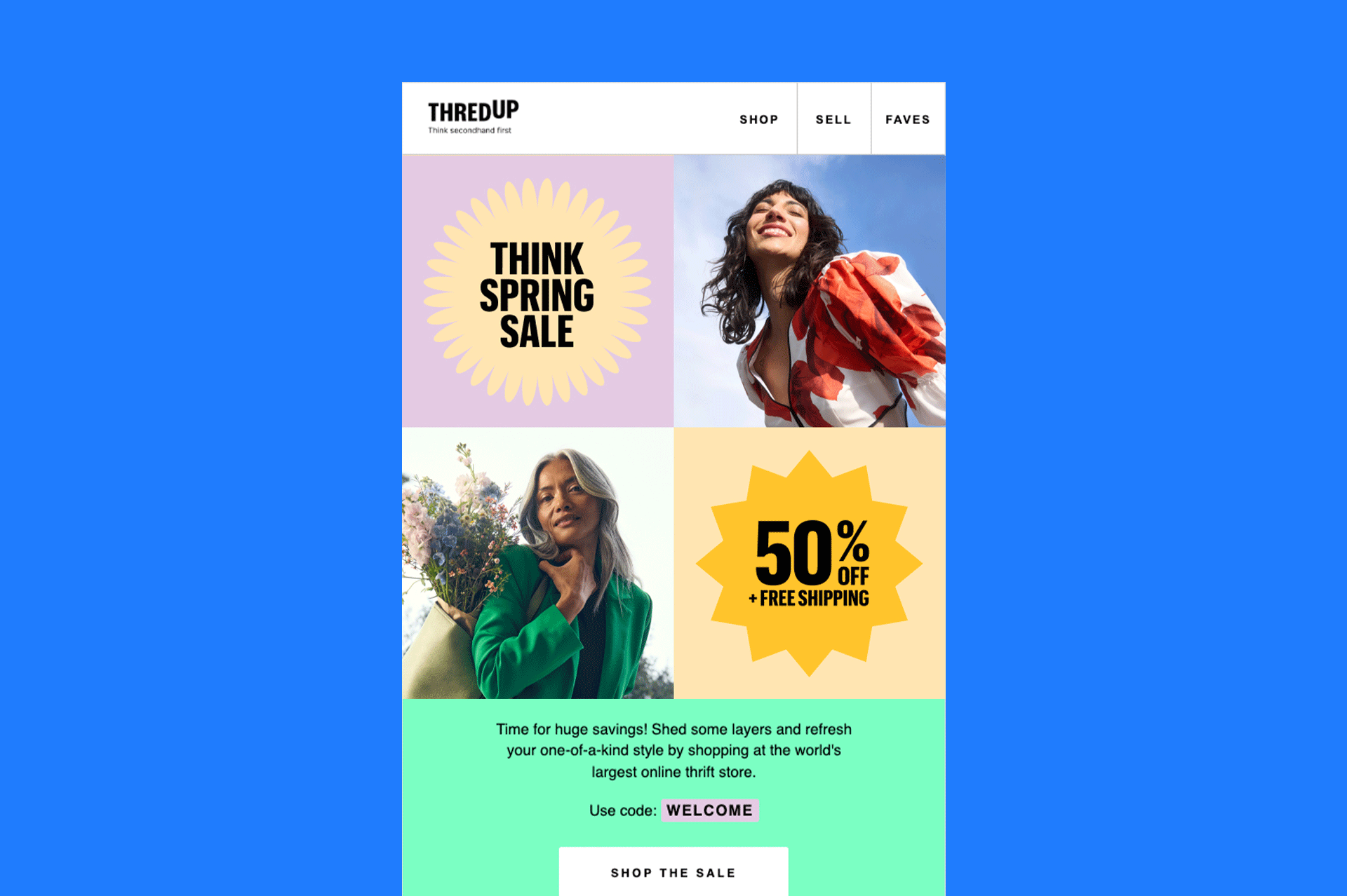
THINK SPRING sale CAMPAIGNThredUp’s Spring Sale was focused on individuality and unique style. I created visuals with playful “blossom” frames to highlight each person’s uniqueness. I wanted to capture the excitement of sunshine and flowers by playing with vibrant colors and dynamic shapes.


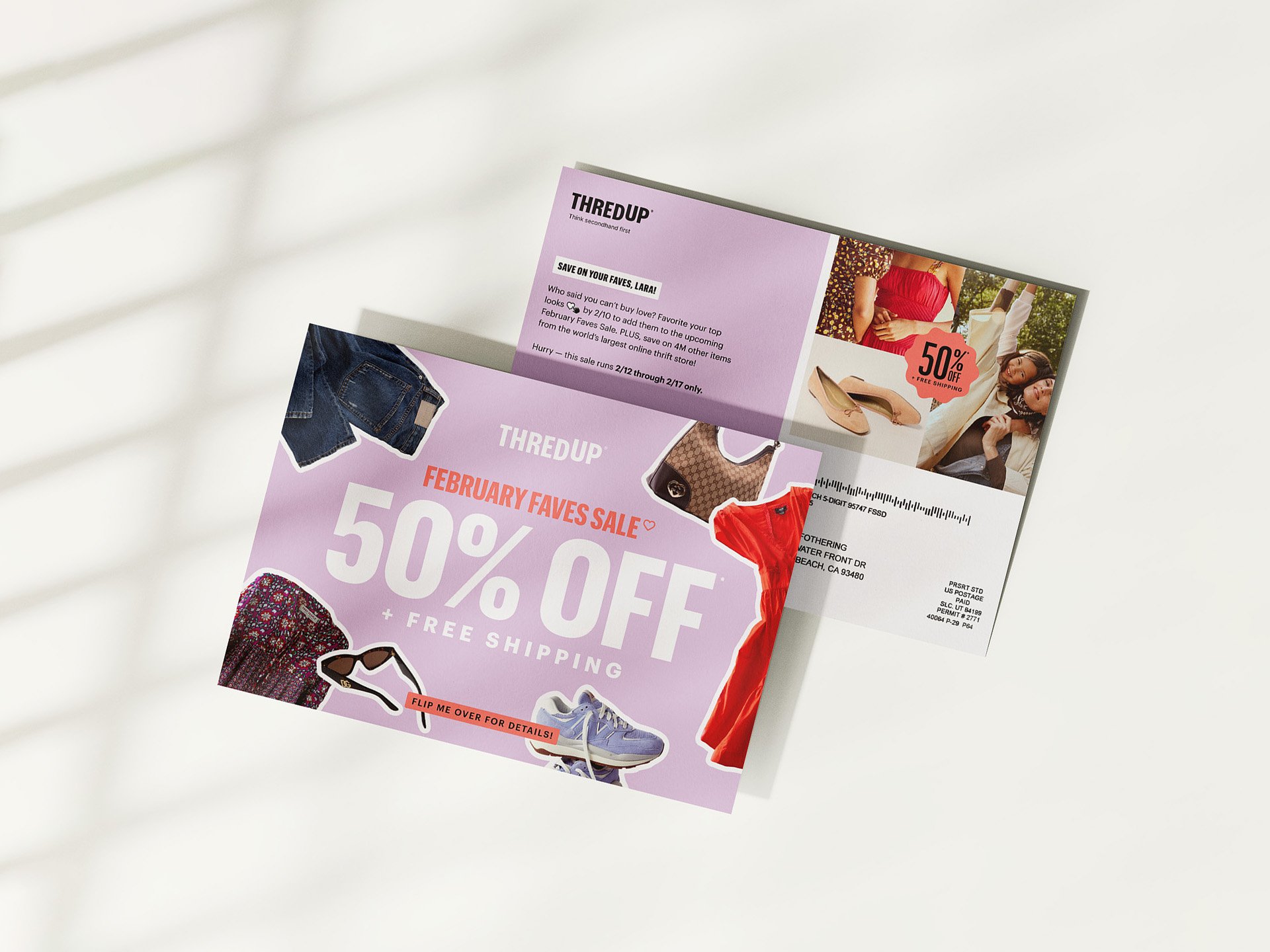
February faves sale campaignThredUp’s Valentine’s Day Sale featured items that had been “favorited” or “hearted” on the website. Drawing inspiration from grade school Valentine grams and stickers, I aimed to create a fun, eye-catching design that highlighted a variety of products while incorporating the “favoriting heart” into the sale logotype.